Warsaw Crawl
Introduction
Warsaw Crawl is an organized pub and club crawl created by three Australian friends who firmly believe that a night out in Poland’s capital should be an unforgettable experience. Drawing on their years of expertise from running successful party-focused businesses in Kraków, they set their sights on conquering the country’s largest city.
Logo
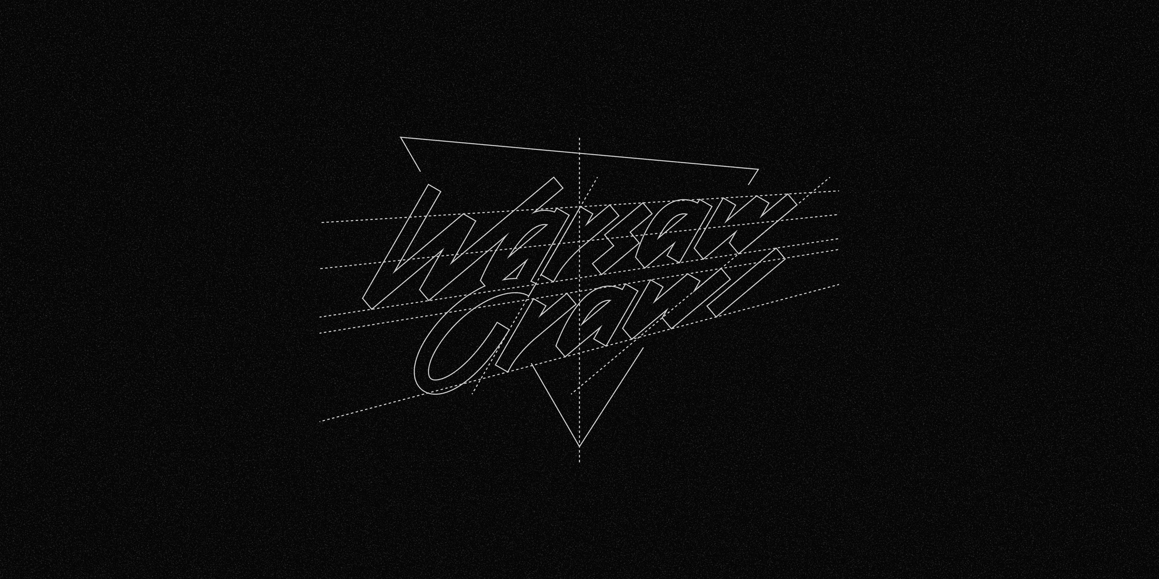
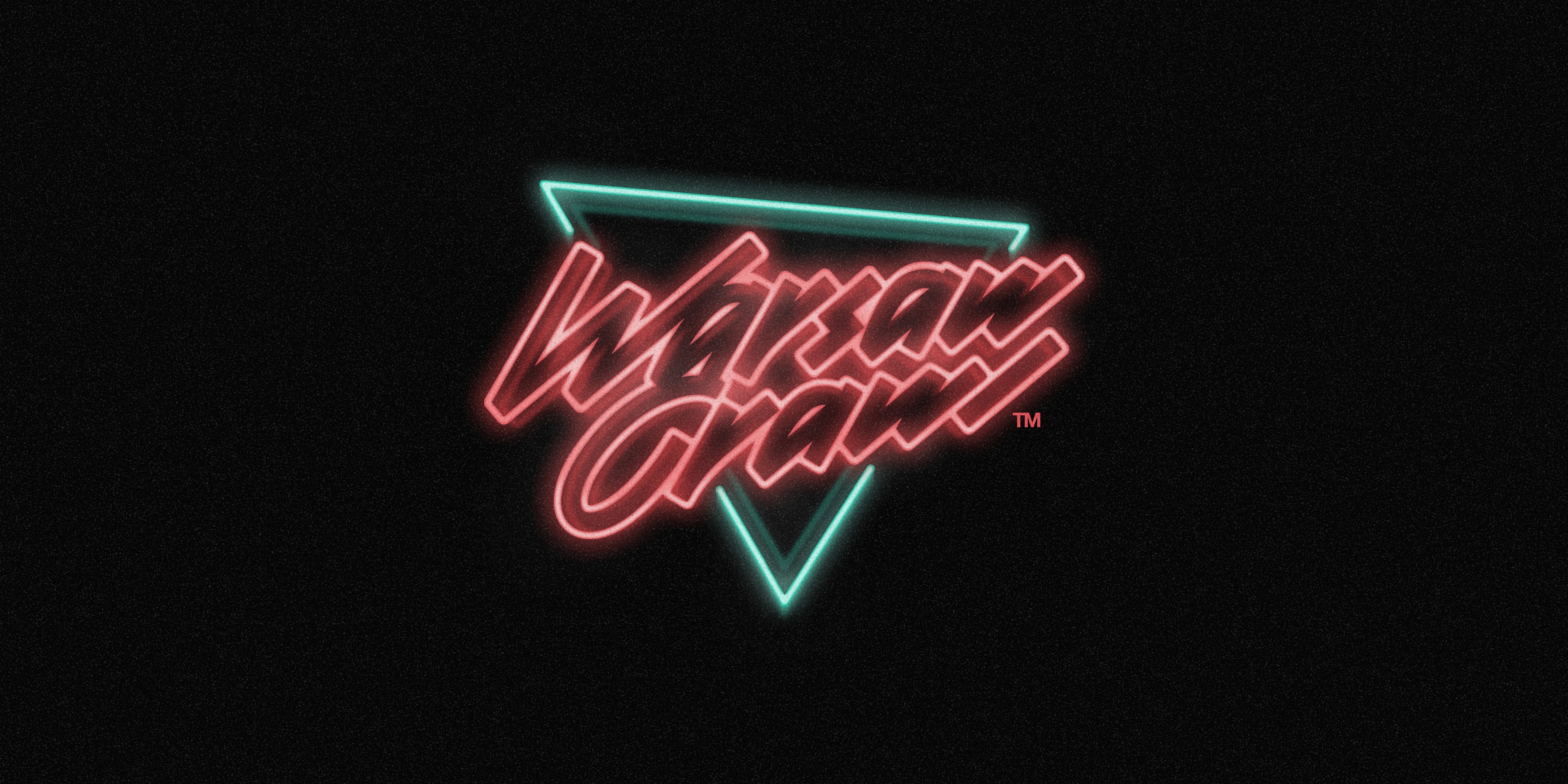
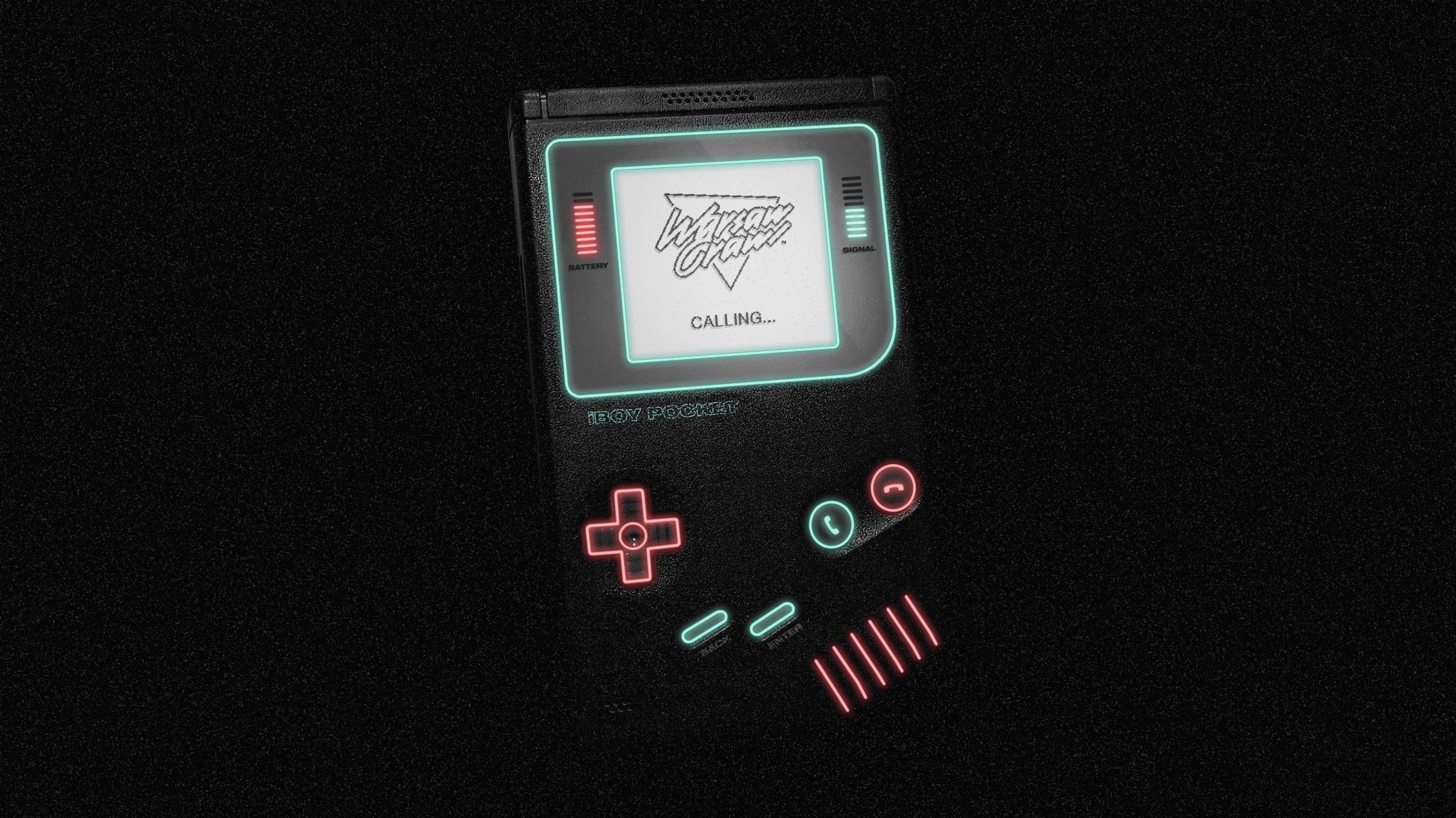
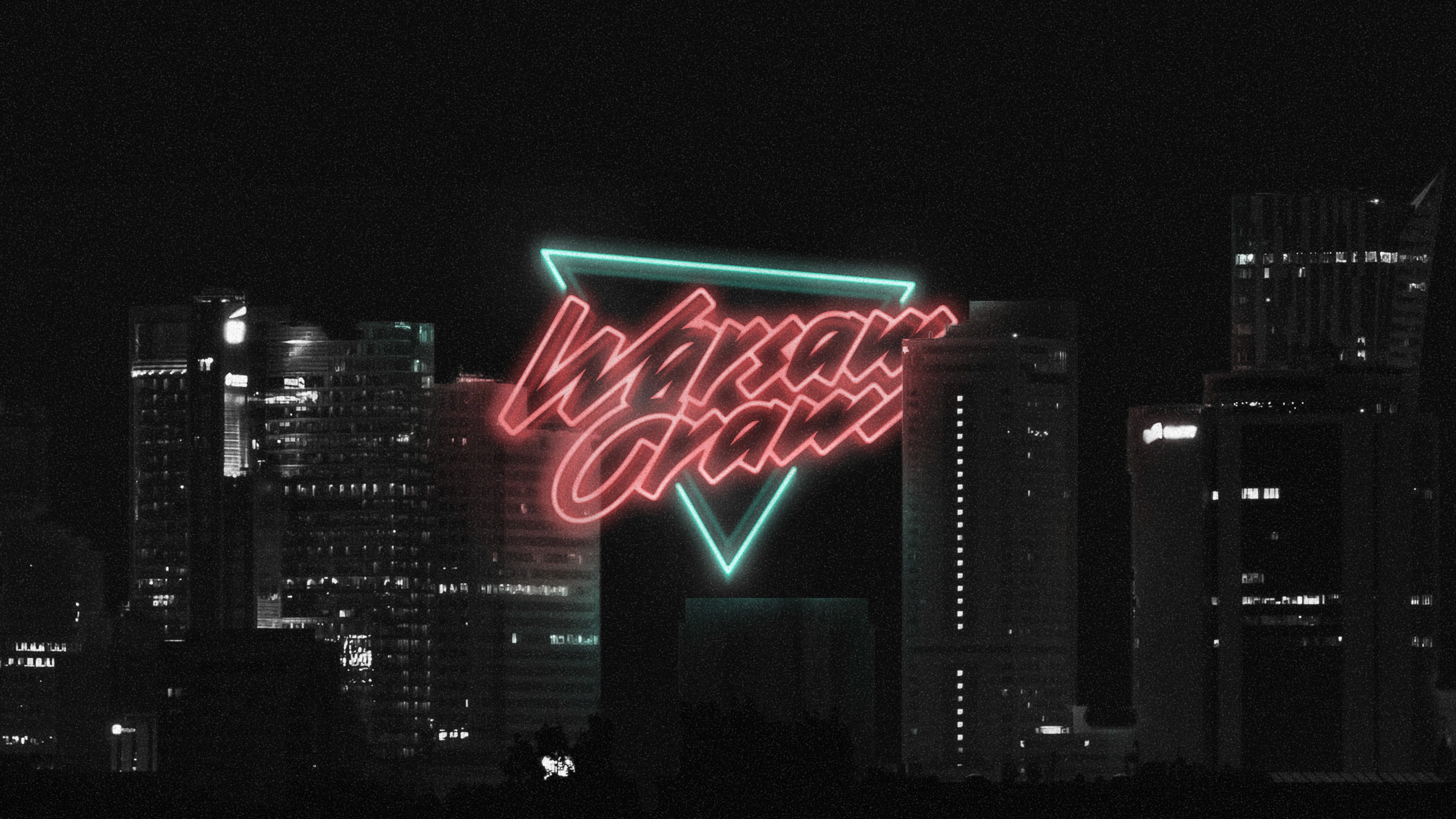
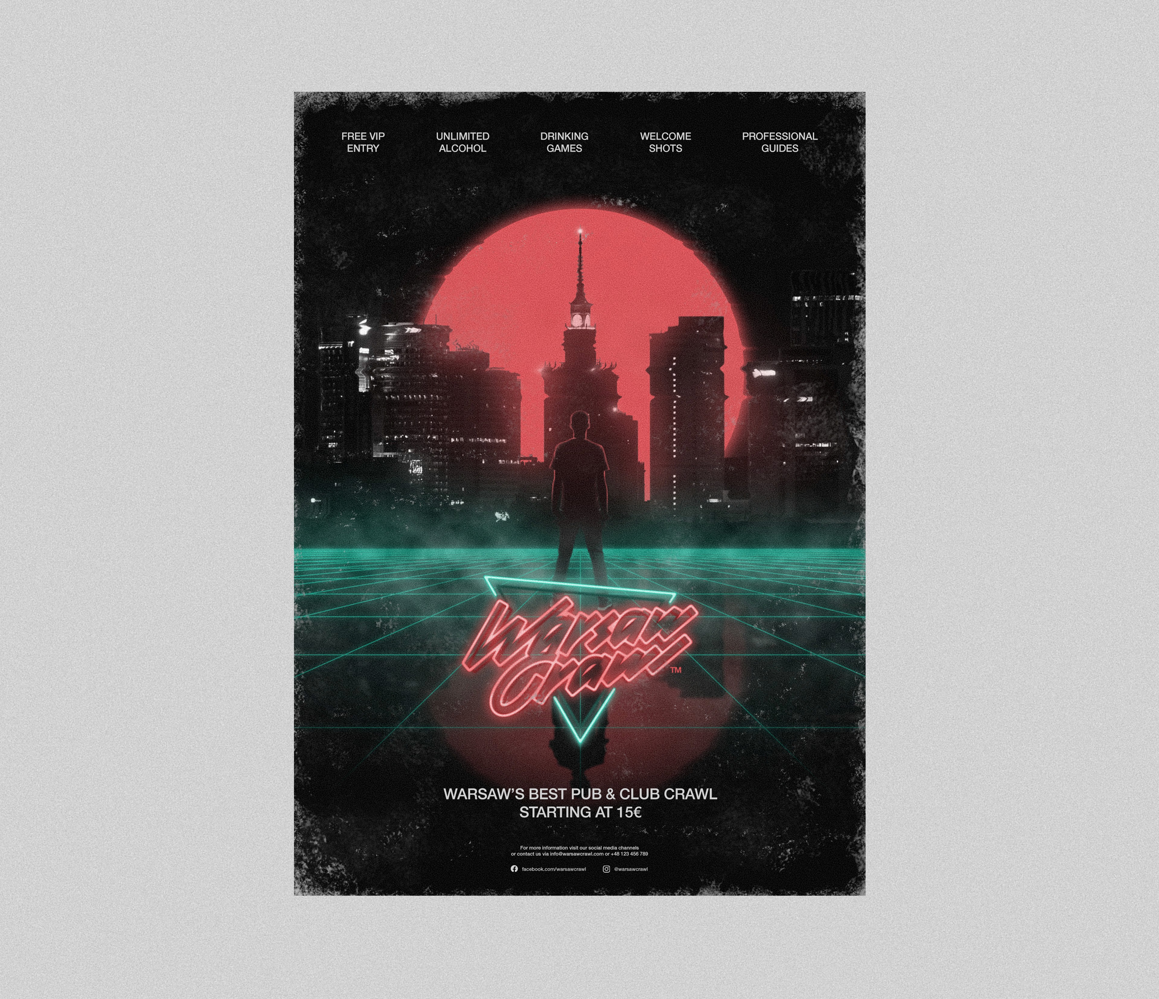
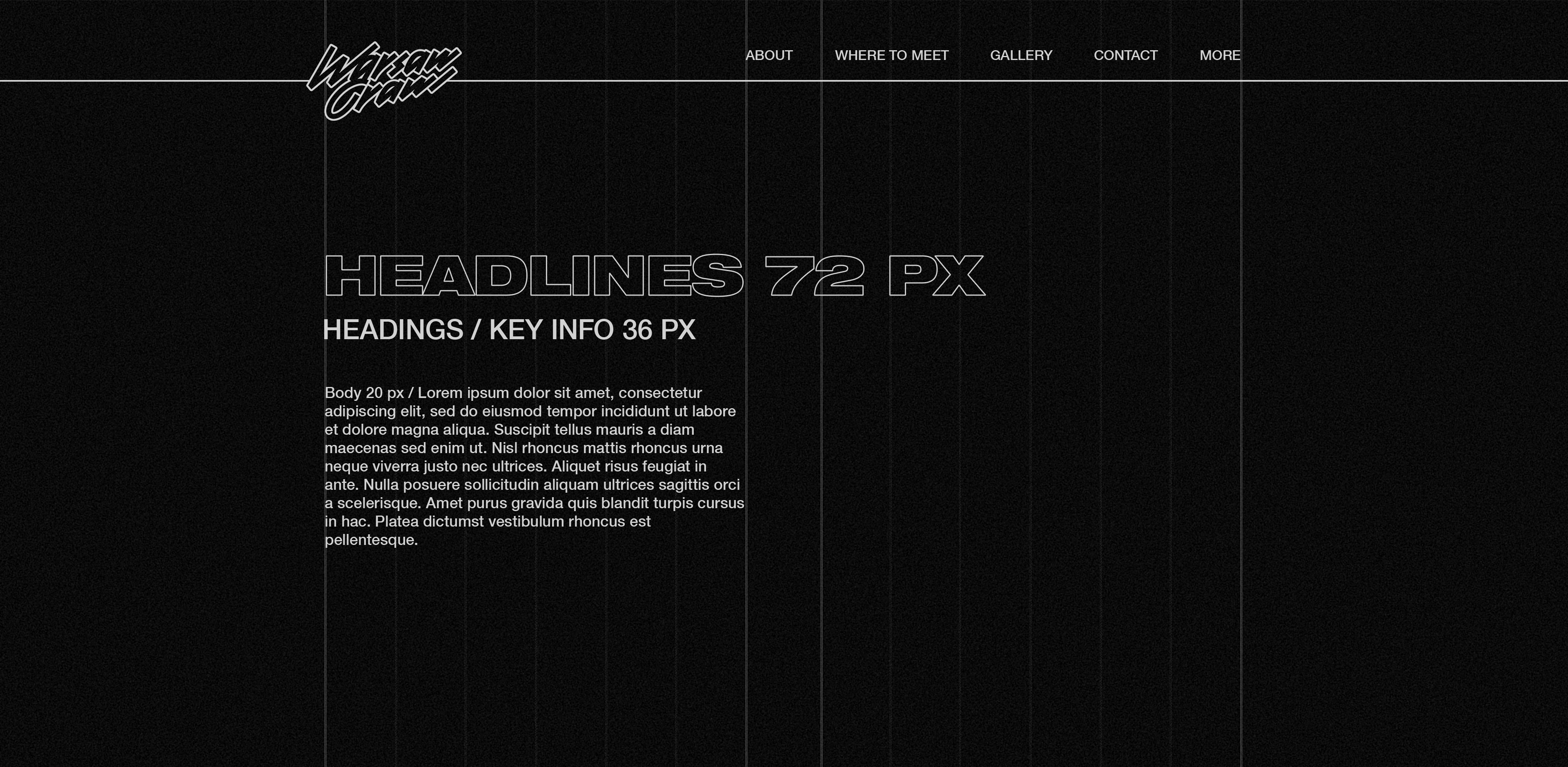
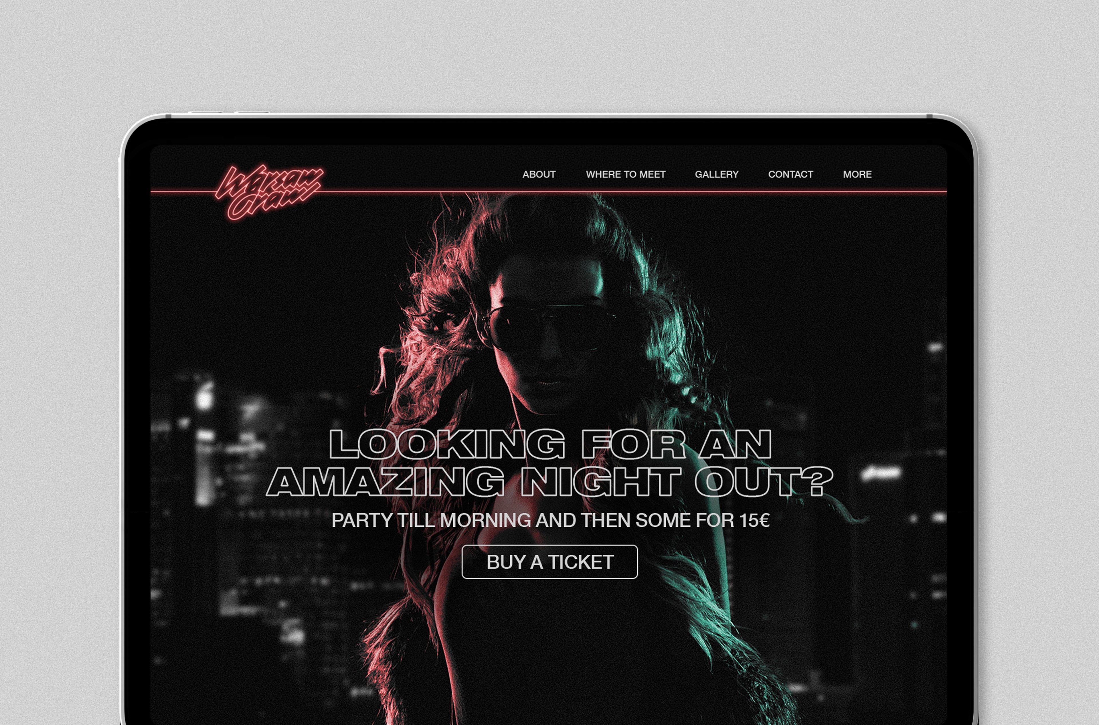
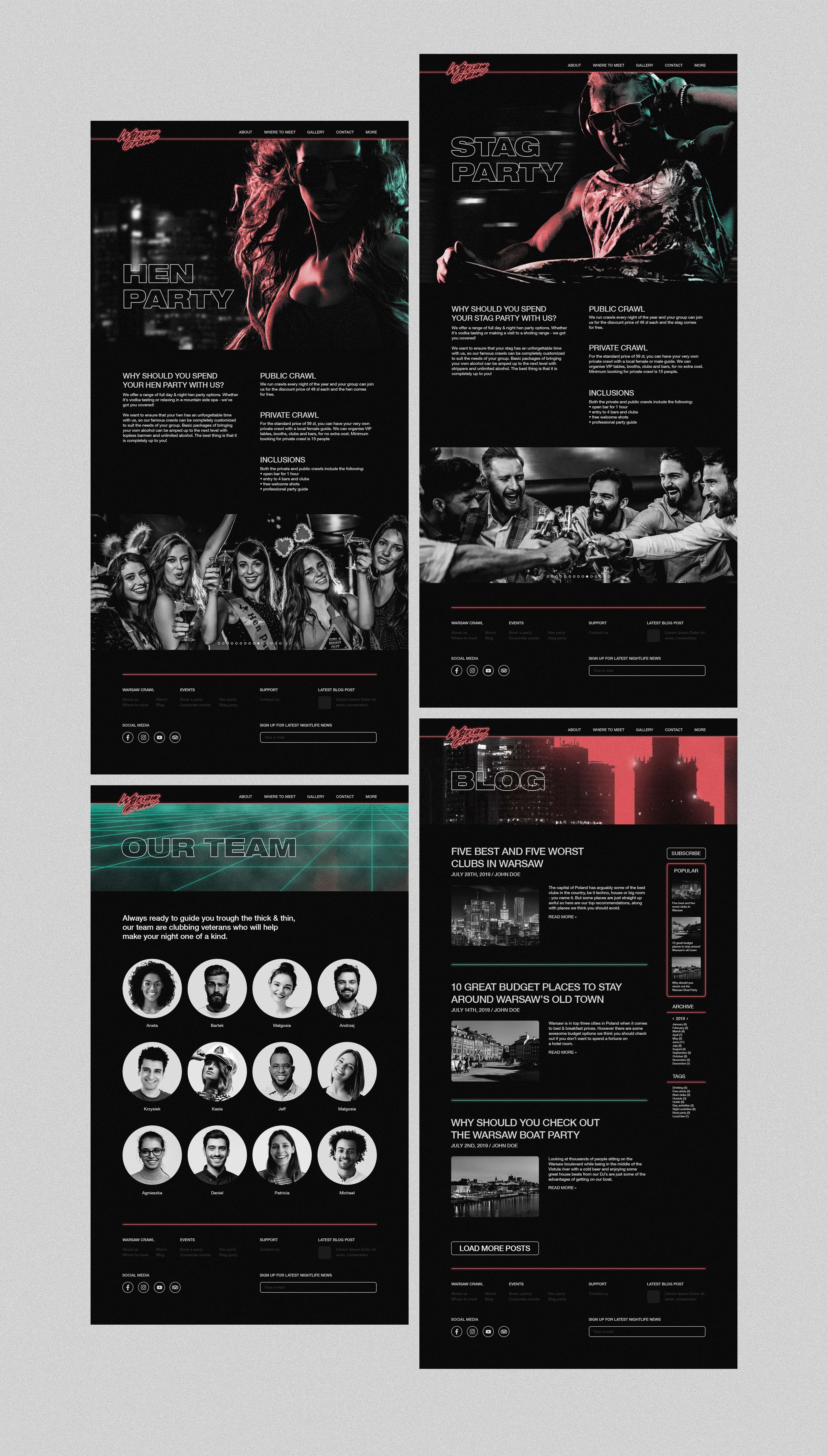
Inspired by the brushpen-style logos of the 1980s, it combines a modern and minimalistic design with consistent stem width and uniform angles across all glyphs. The addition of a neon effect serves as the finishing touch, perfectly aligning the symbol with the retrowave aesthetic of the brand.
Art direction
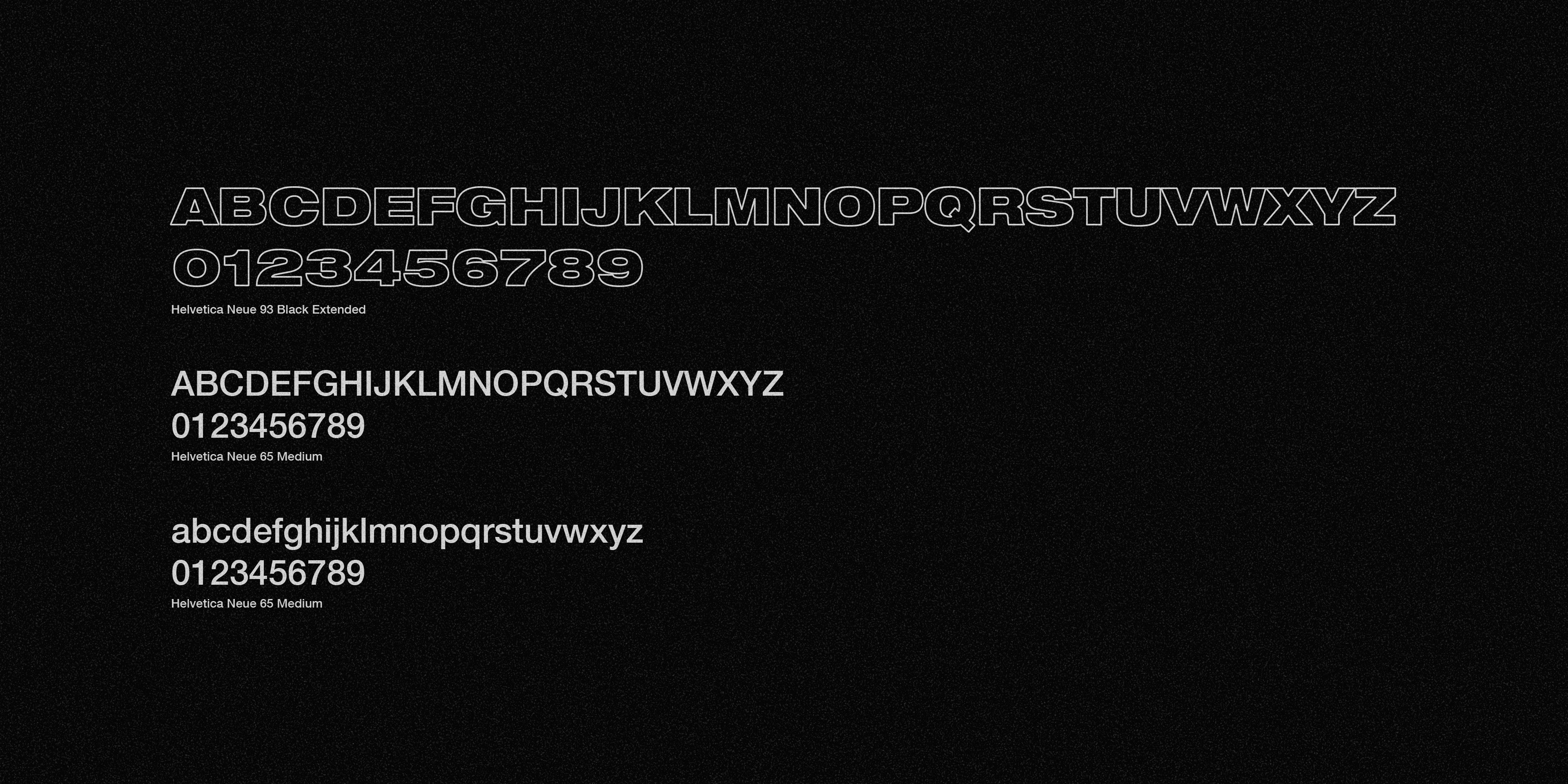
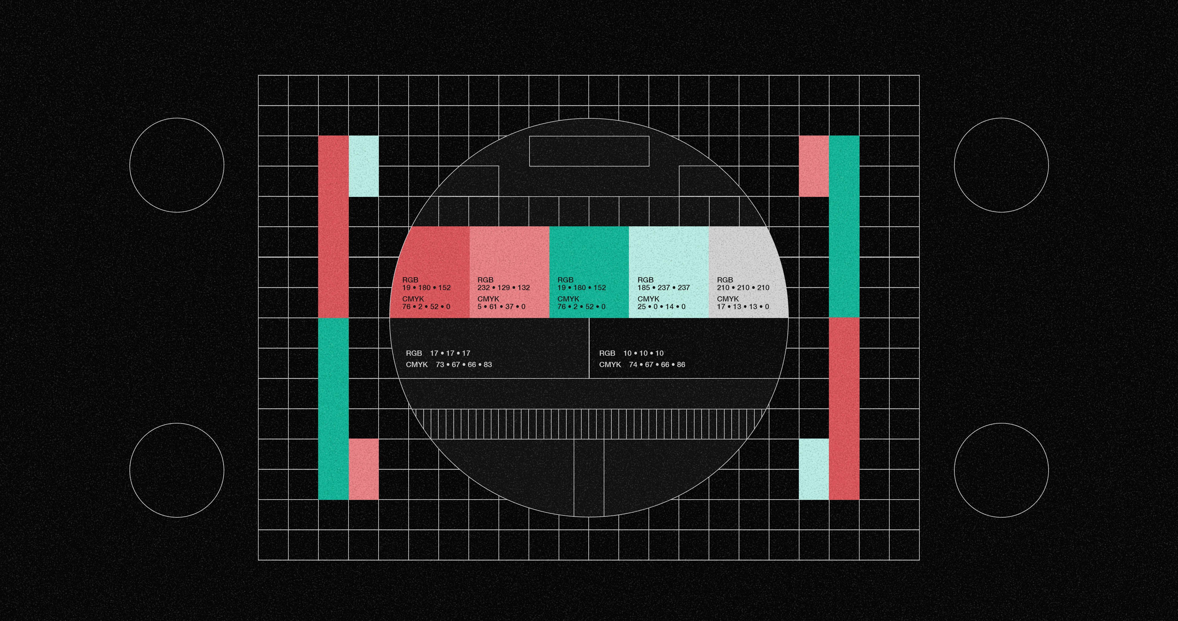
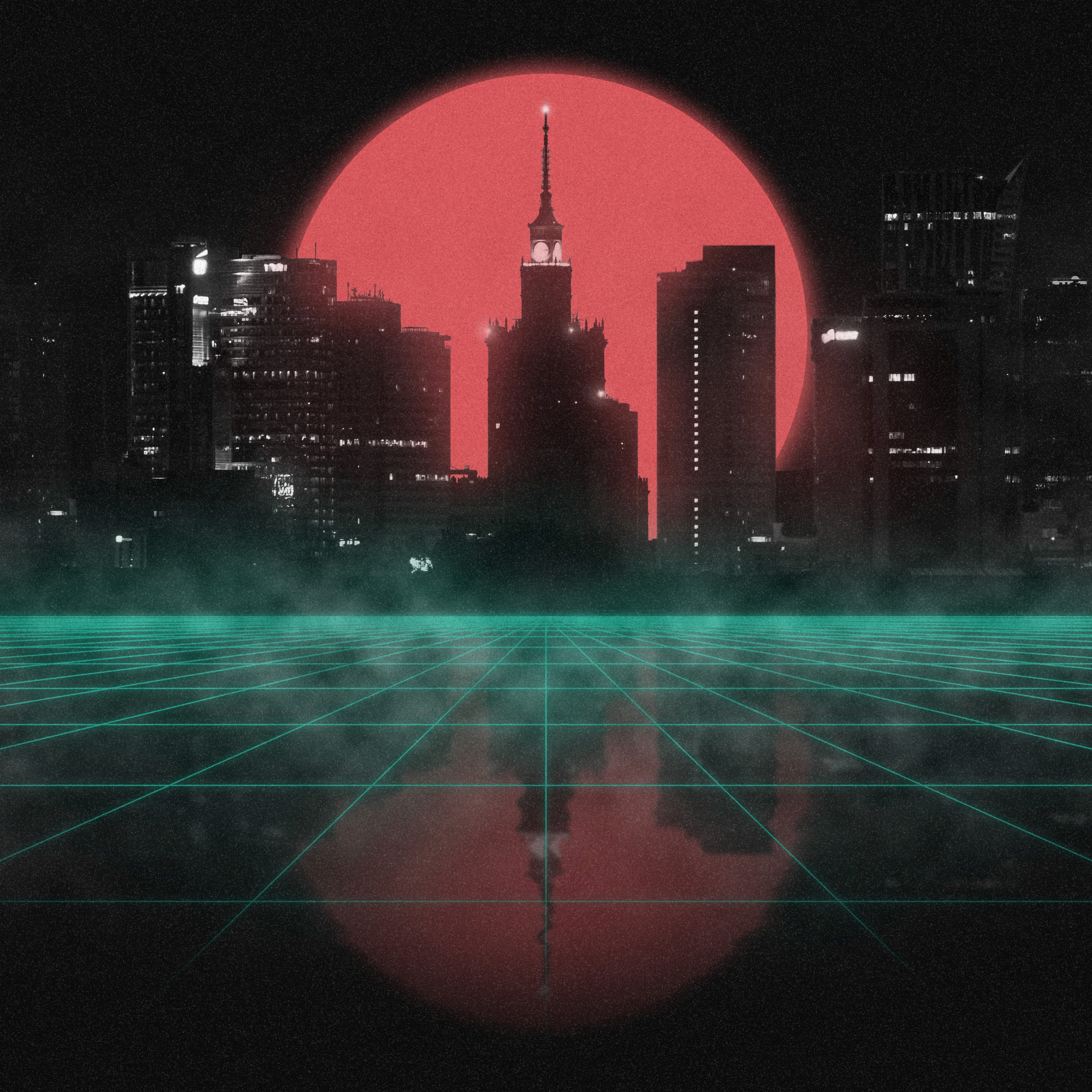
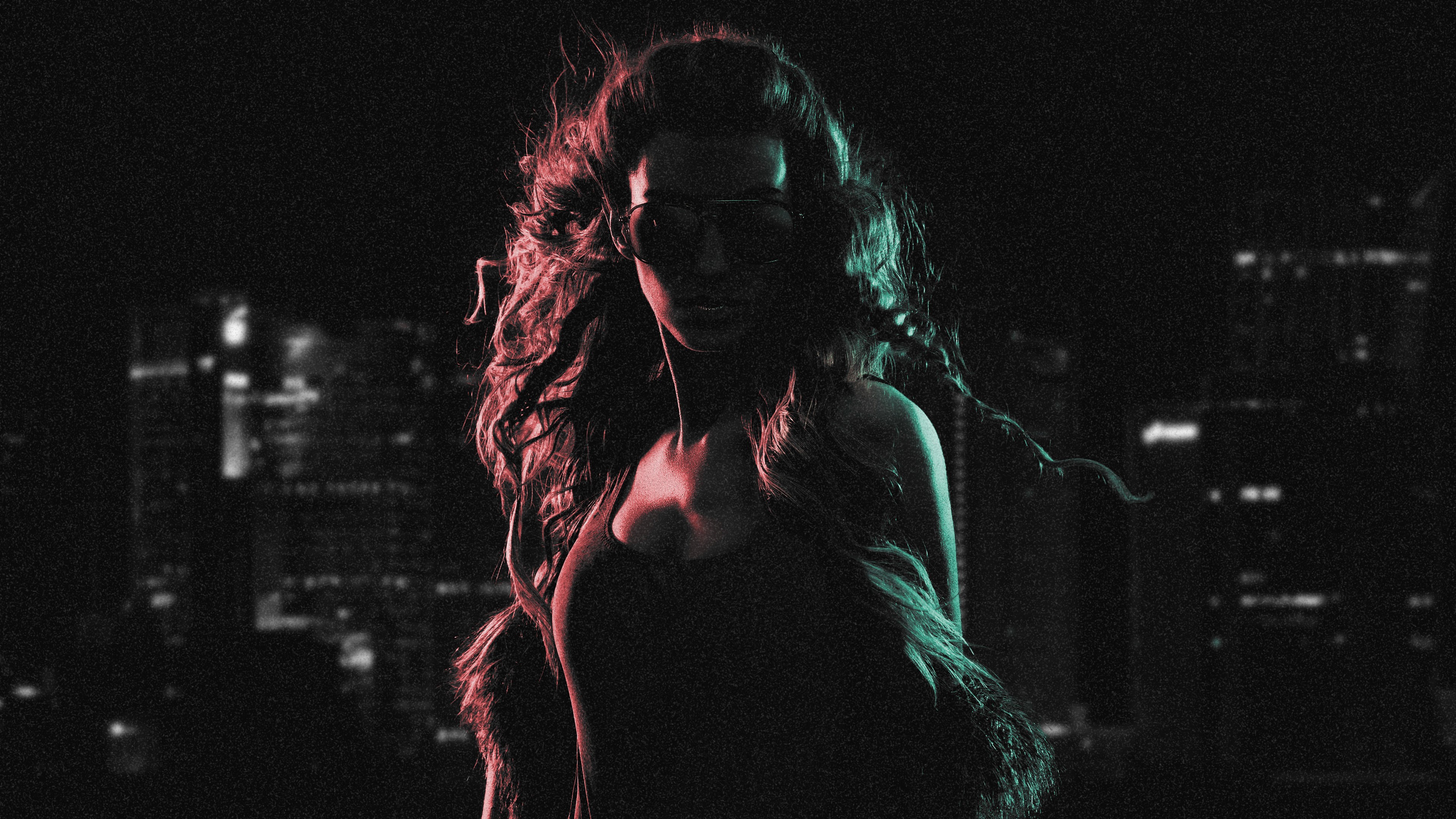
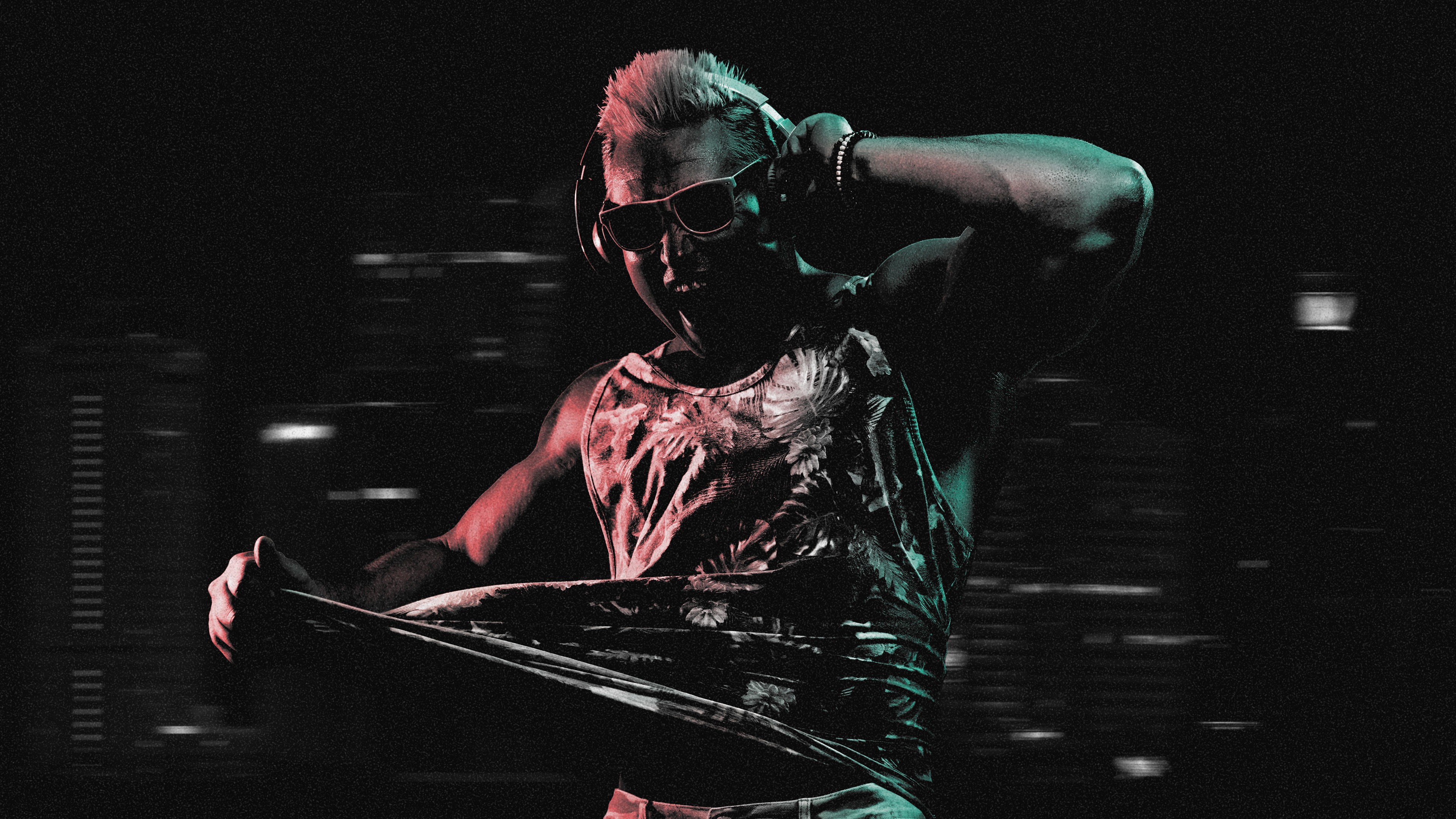
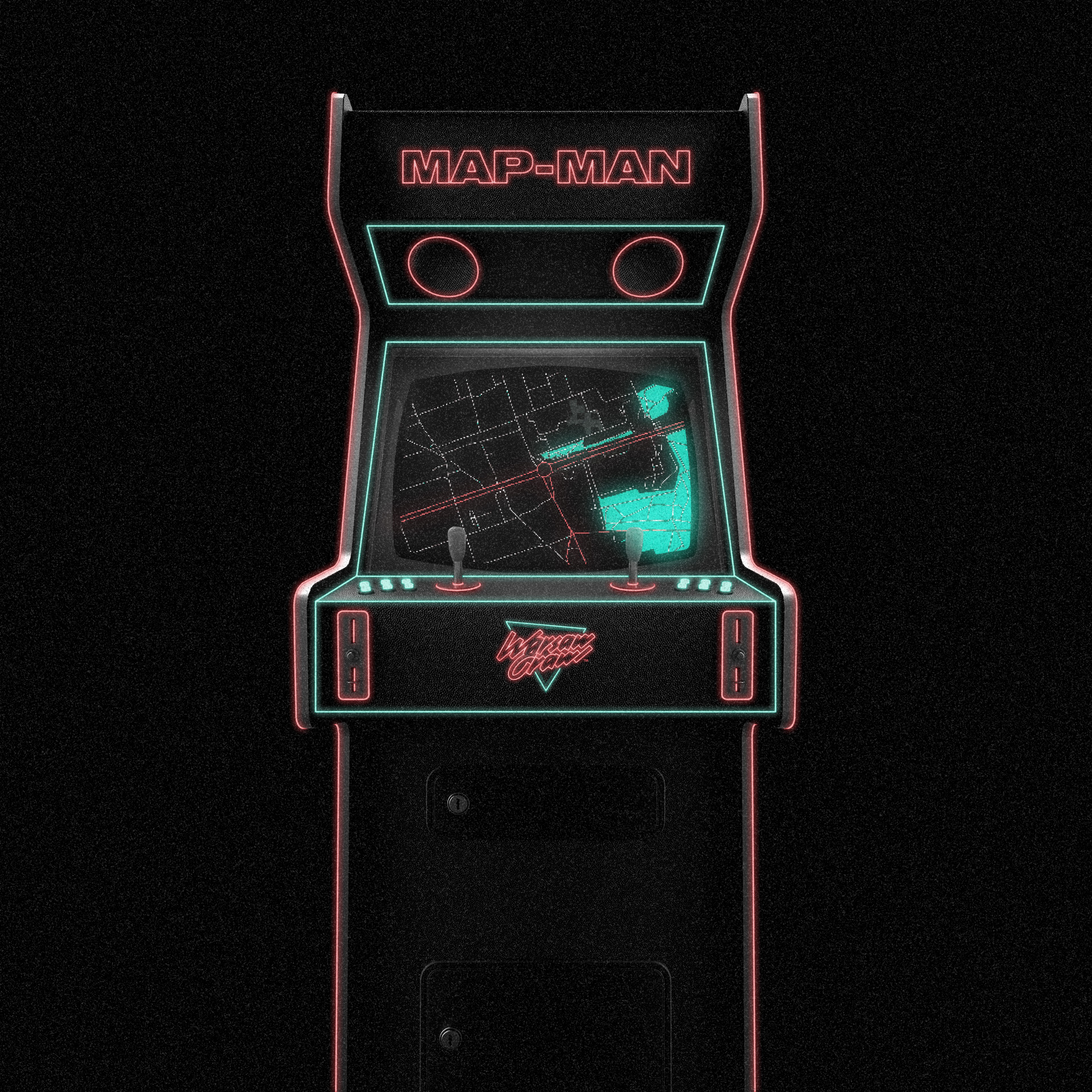
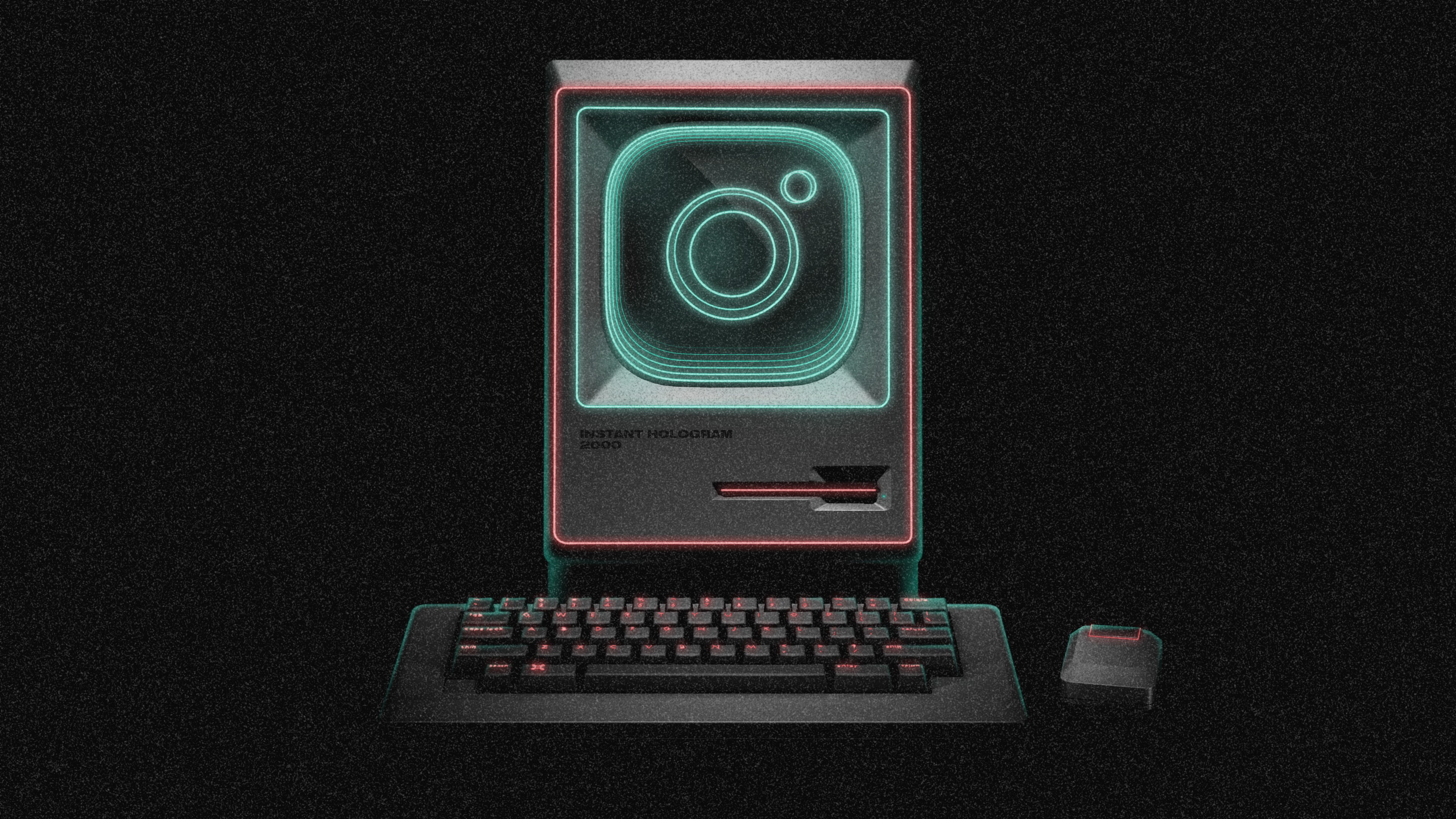
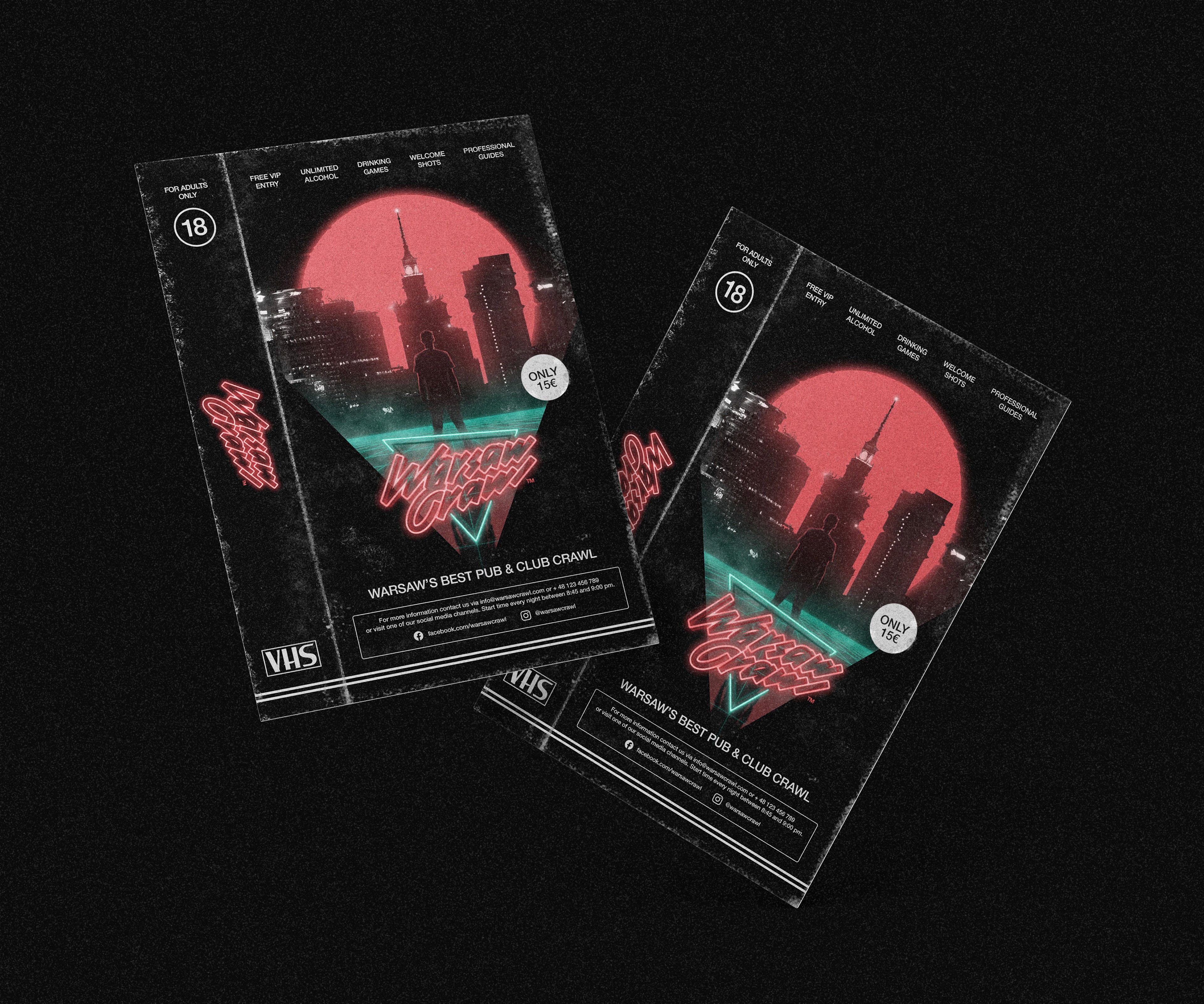
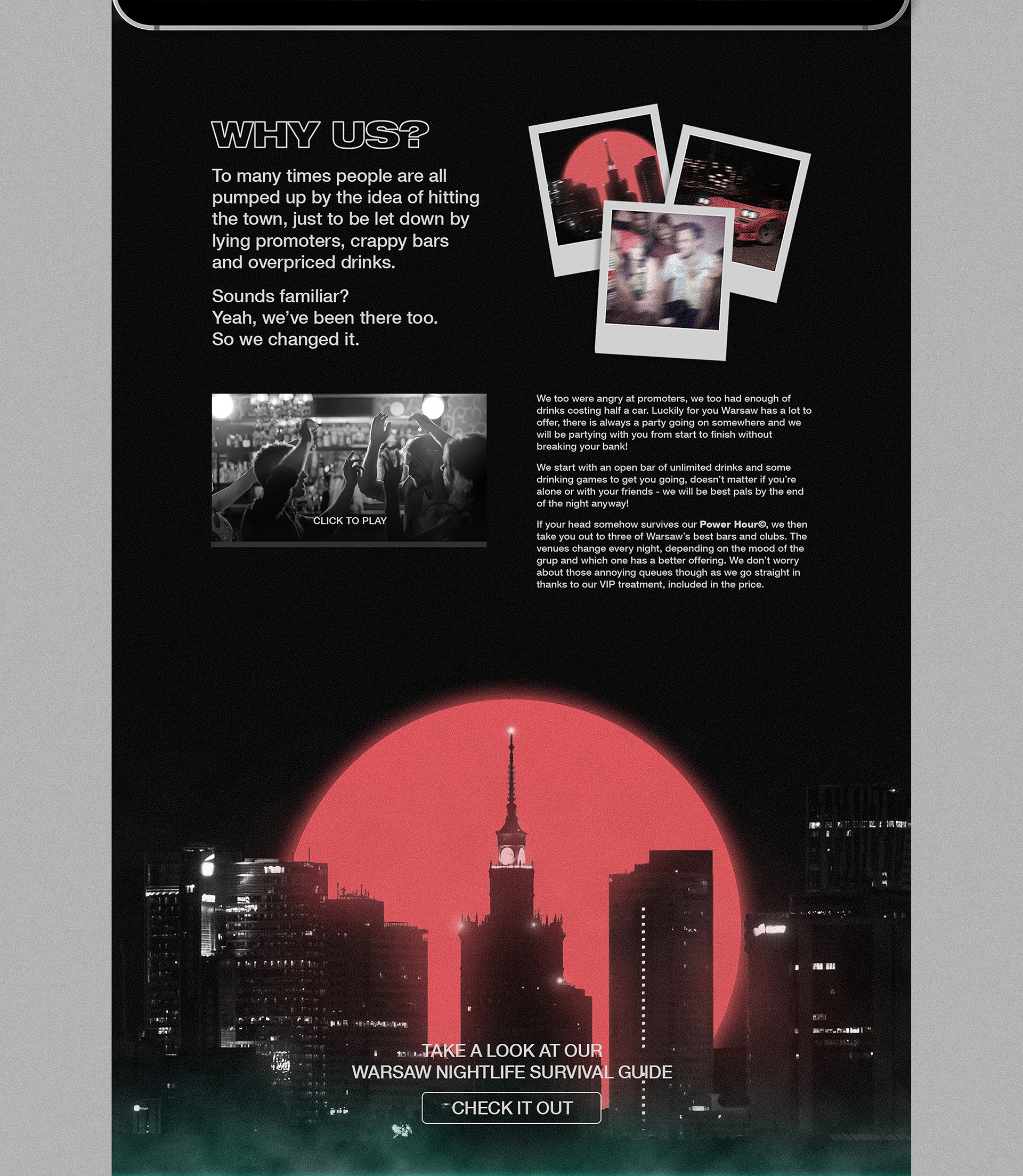
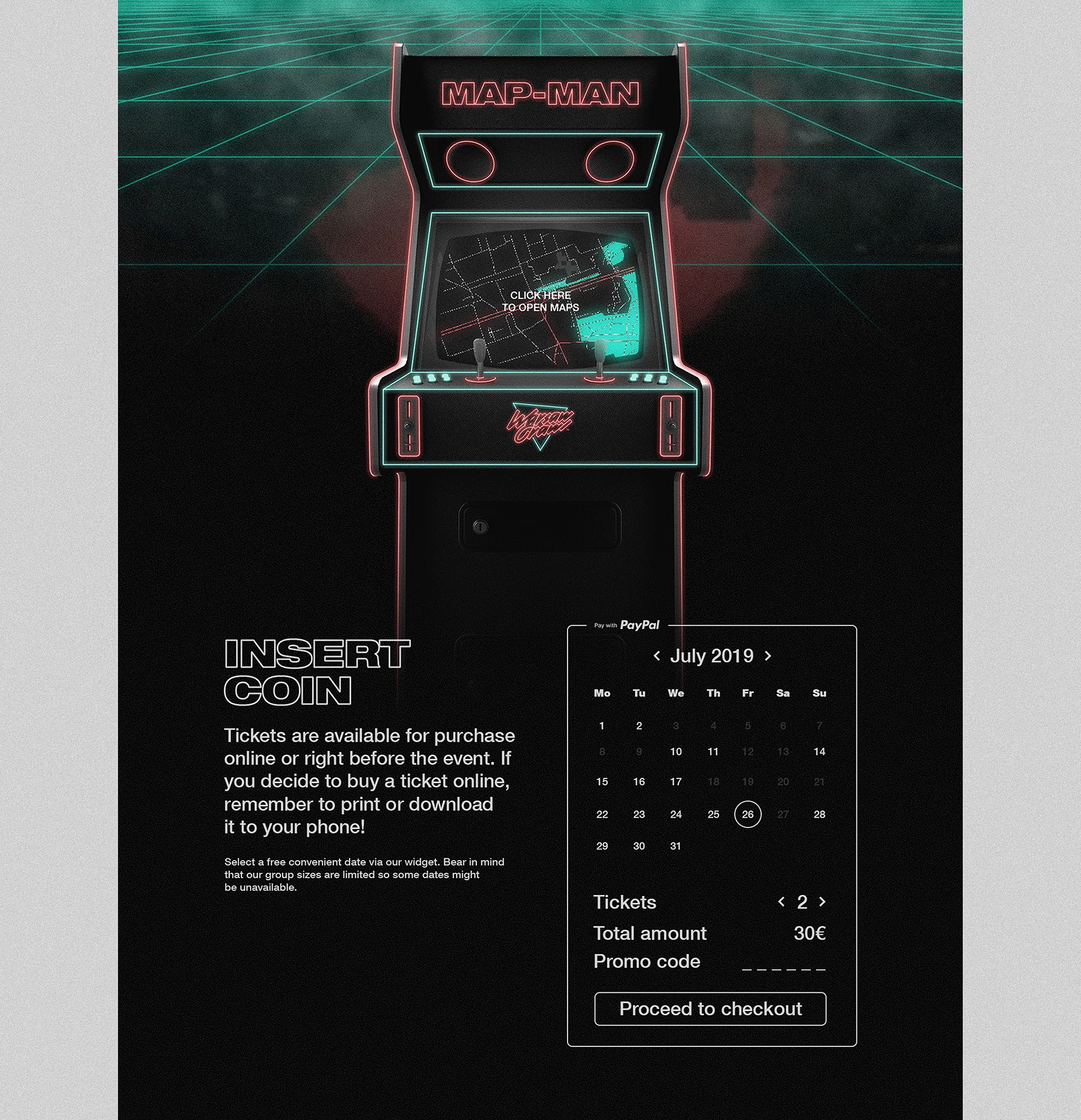
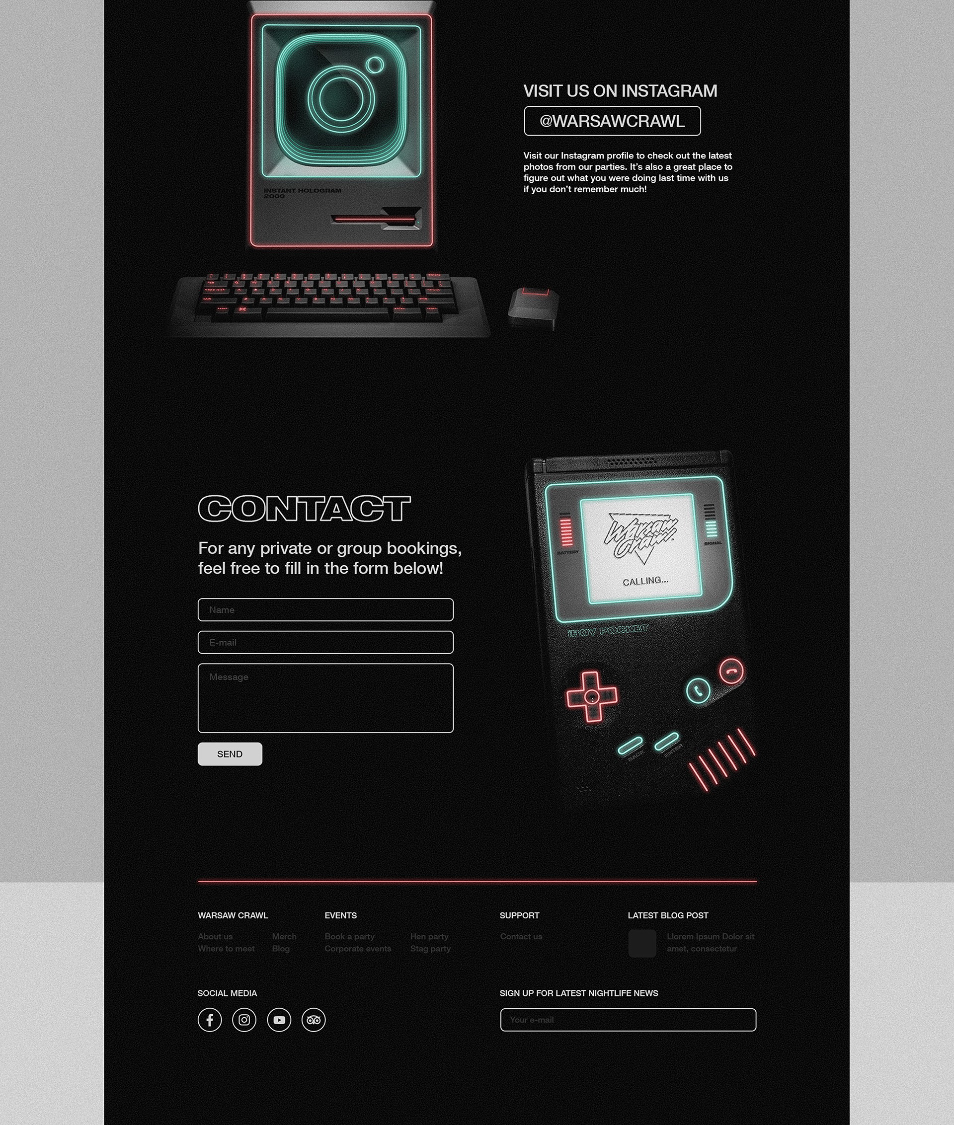
1980s Poland might not have resembled the glitzy scenes of "Miami Vice", but the influence of Western pop culture was very much alive.
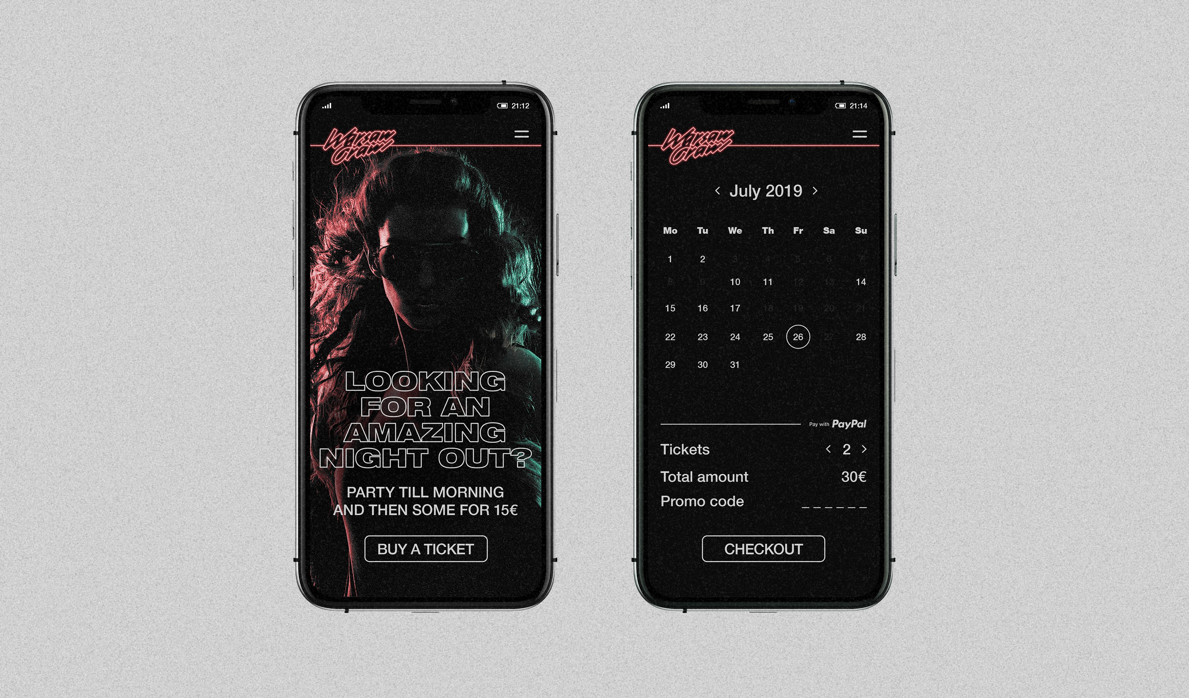
With competitors steering clear of this aesthetic, it presented a unique opportunity to stand out while showcasing Warsaw in an unconventional and unexpected light. Combine that with the fact that many of today’s party-goers were born in the ’80s and ’90s, and you have a nostalgic punch that grabs their attention and leaves a lasting impression.
Credits
Commisioned by:
MLM Events
Design and execution:
Jerzy Zaręba
Got a project?
Menu
Warsaw Crawl
Introduction
Warsaw Crawl is an organized pub and club crawl created by three Australian friends who firmly believe that a night out in Poland’s capital should be an unforgettable experience. Drawing on their years of expertise from running successful party-focused businesses in Kraków, they set their sights on conquering the country’s largest city.


Logo
Inspired by the brushpen-style logos of the 1980s, it combines a modern and minimalistic design with consistent stem width and uniform angles across all glyphs. The addition of a neon effect serves as the finishing touch, perfectly aligning the symbol with the retrowave aesthetic of the brand.


Art direction
1980s Poland might not have resembled the glitzy scenes of "Miami Vice", but the influence of Western pop culture was very much alive.
With competitors steering clear of this aesthetic, it presented a unique opportunity to stand out while showcasing Warsaw in an unconventional and unexpected light. Combine that with the fact that many of today’s party-goers were born in the ’80s and ’90s, and you have a nostalgic punch that grabs their attention and leaves a lasting impression.


Credits
Commisioned by:
MLM Events
Design and execution:
Jerzy Zaręba
Got a project?
Menu
