Introduction
Introduction
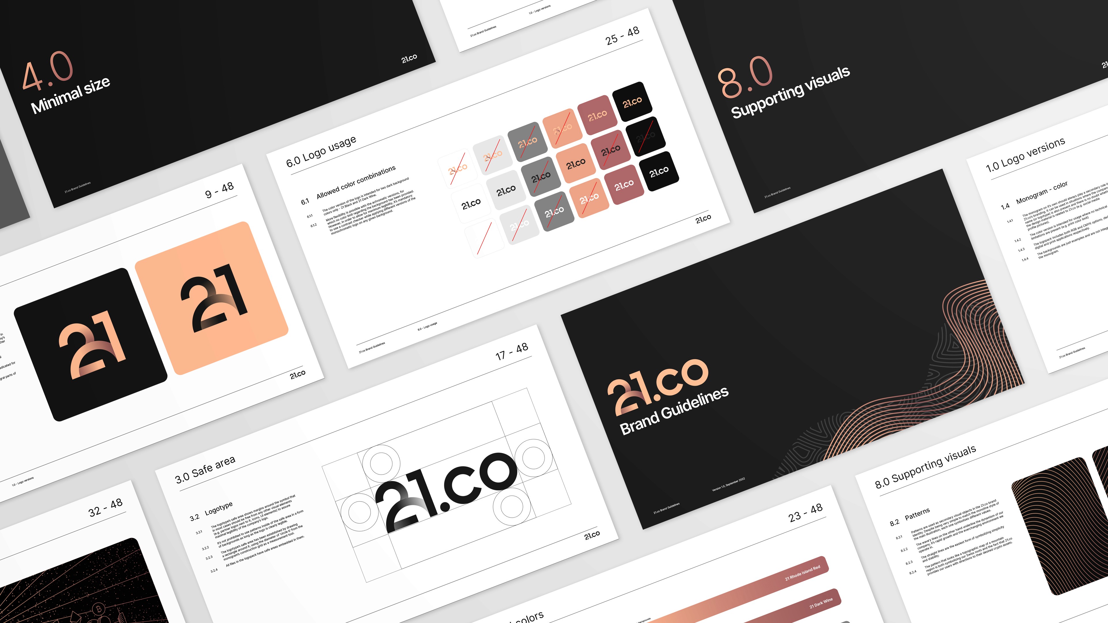
21.co has been established as the parent company of Onyx, Amun and one of the most recognizable names on Switzerland's fin-tech landscape: 21shares. The need for an umbrella brand became apparent when the ambitions of the founders started outgrowing the original concept of having just the original triad of crypto related ventures.My role was to figure out the visual direction, the company's logo, colors, fonts and icons for various usage. I also co-designed the website and created some animations that assisted the launch of the brand.
21.co has been established as the parent company of Onyx, Amun and one of the most recognizable names on Switzerland's fin-tech landscape: 21shares. The need for an umbrella brand became apparent when the ambitions of the founders started outgrowing the original concept of having just the original triad of crypto related ventures.My role was to figure out the visual direction, the company's logo, colors, fonts and icons for various usage. I also co-designed the website and created some animations that assisted the launch of the brand.
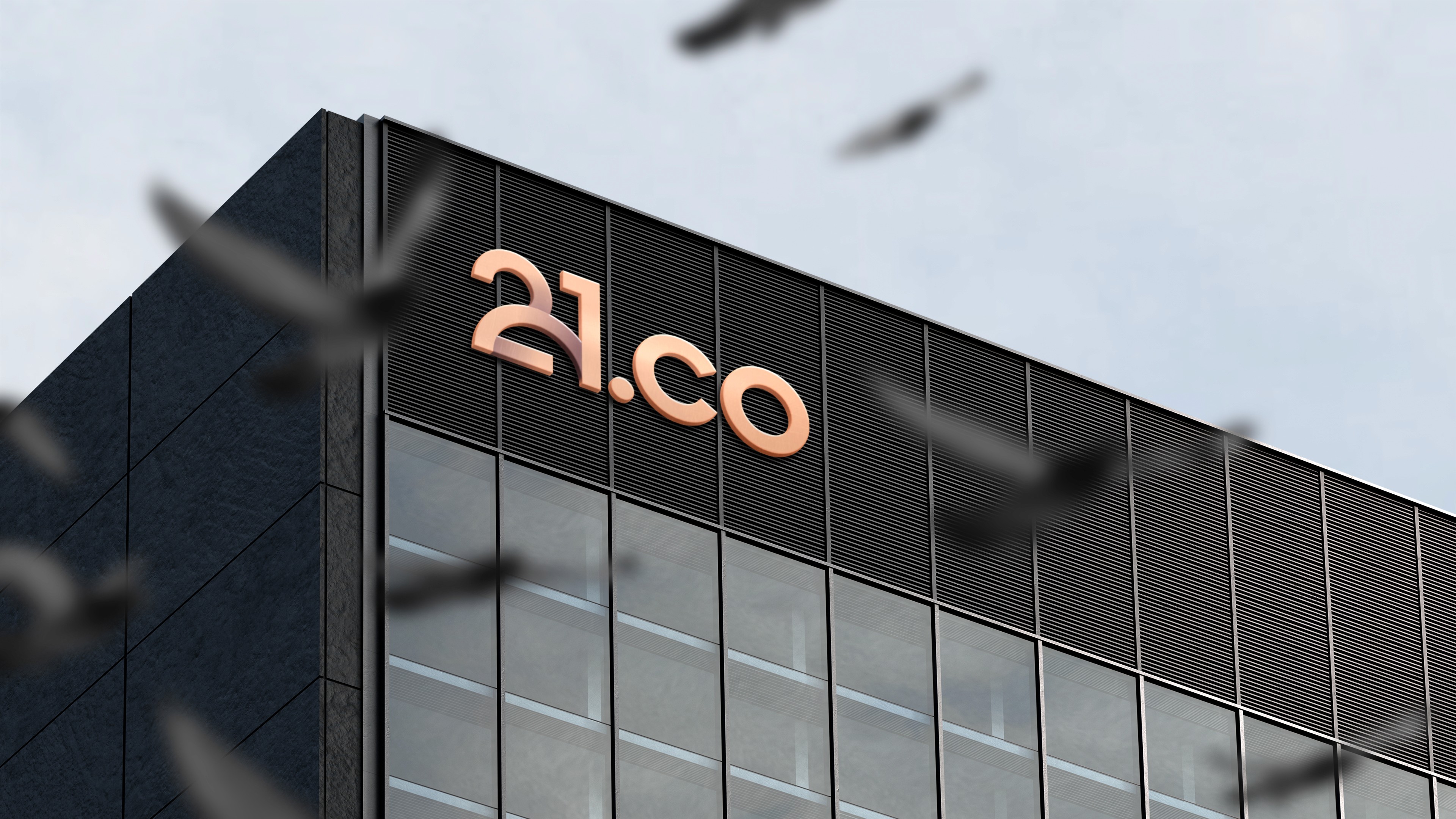
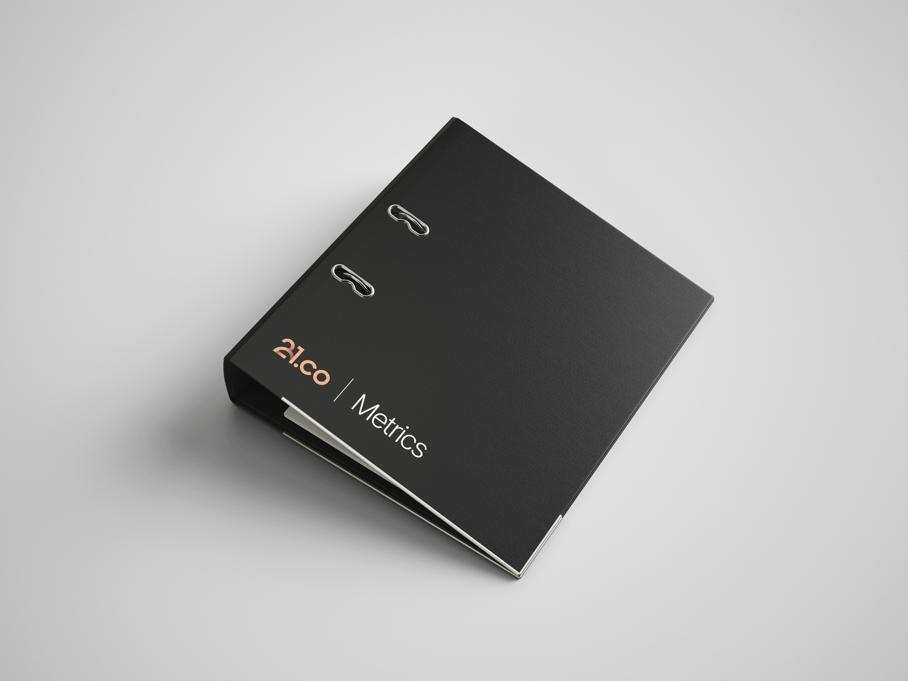
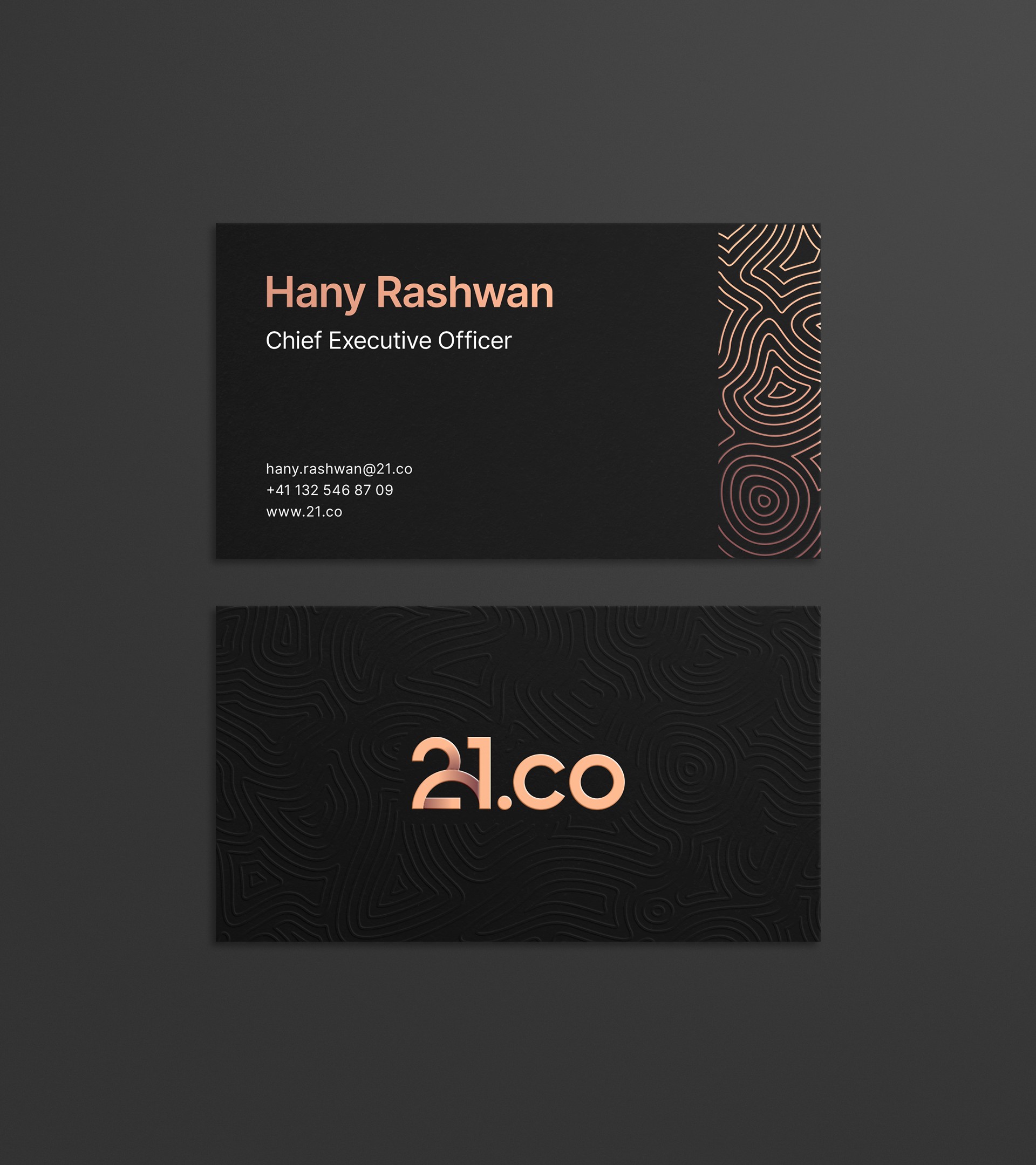
Logomark
Logomark
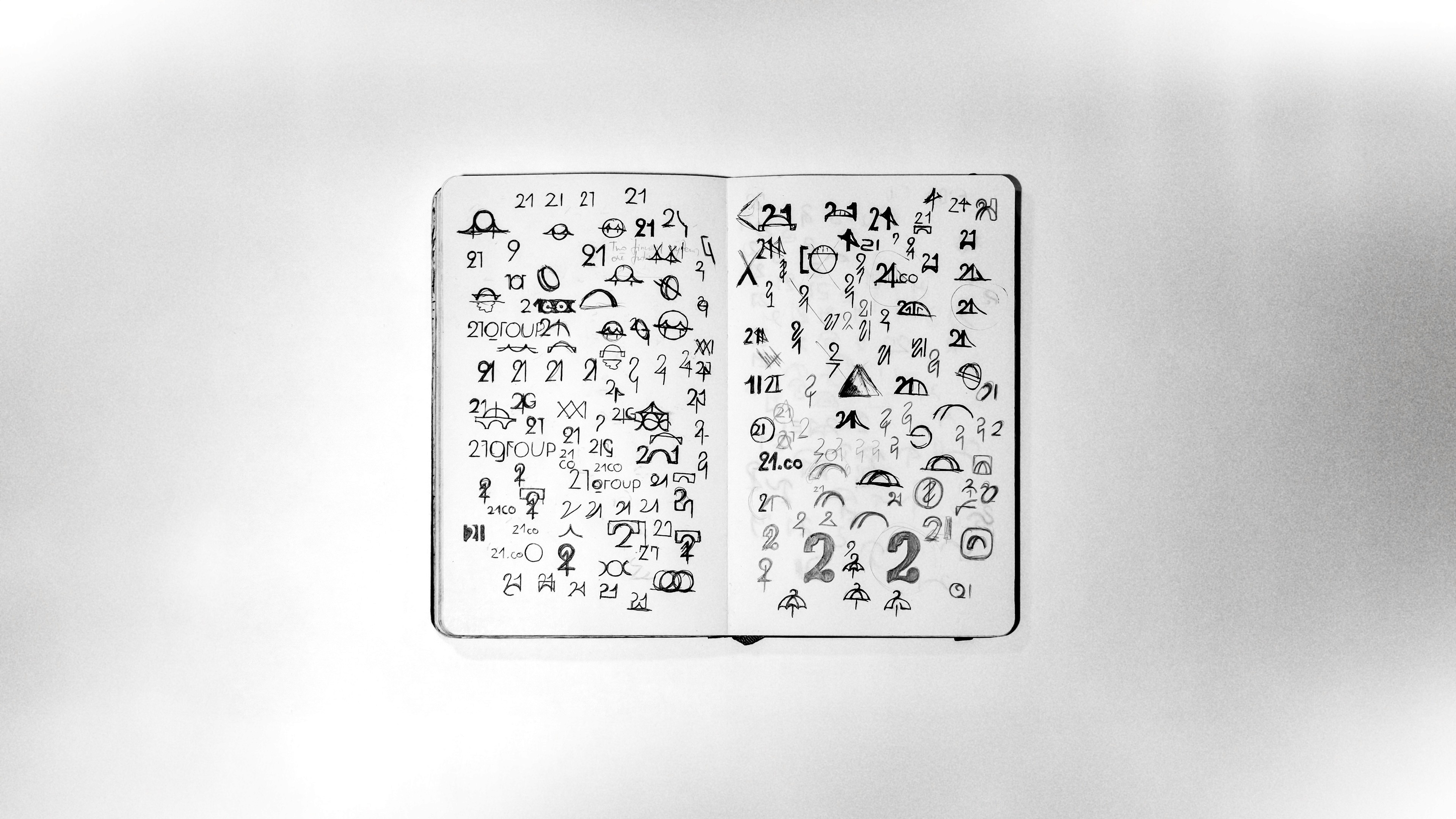
Although the number's 21 symbolism is pretty known in the crypto space and references the fact that there will be 21 million Bitcoins in total, the arc in the logomark has a deeper and less common meaning. It symbolizes the journey from two financial systems we find ourselves in right now, which often not only don't work together but even fight each other, to a world where there will be only one - consisting of elements from both traditional and decentralized finance. It also symbolises a bridge, which references the company's slogan "building bridges into the crypto world".
Although the number's 21 symbolism is pretty known in the crypto space and references the fact that there will be 21 million Bitcoins in total, the arc in the logomark has a deeper and less common meaning. It symbolizes the journey from two financial systems we find ourselves in right now, which often not only don't work together but even fight each other, to a world where there will be only one - consisting of elements from both traditional and decentralized finance. It also symbolises a bridge, which references the company's slogan "building bridges into the crypto world".
Brand font
Brand font
I chose Inter as the primary font of 21.co and all of it's brands to establish a connection point between them without jeopardizing their own distinctive visual identities. Since the company has Swiss roots it was very fitting to pick such a simple and timeless sans serif, sometimes called the Helvetica of today by some. It also aligns perfectly to the 21.co logotype, which enables creating lockups for various occasions.
I chose Inter as the primary font of 21.co and all of it's brands to establish a connection point between them without jeopardizing their own distinctive visual identities. Since the company has Swiss roots it was very fitting to pick such a simple and timeless sans serif, sometimes called the Helvetica of today by some. It also aligns perfectly to the 21.co logotype, which enables creating lockups for various occasions.
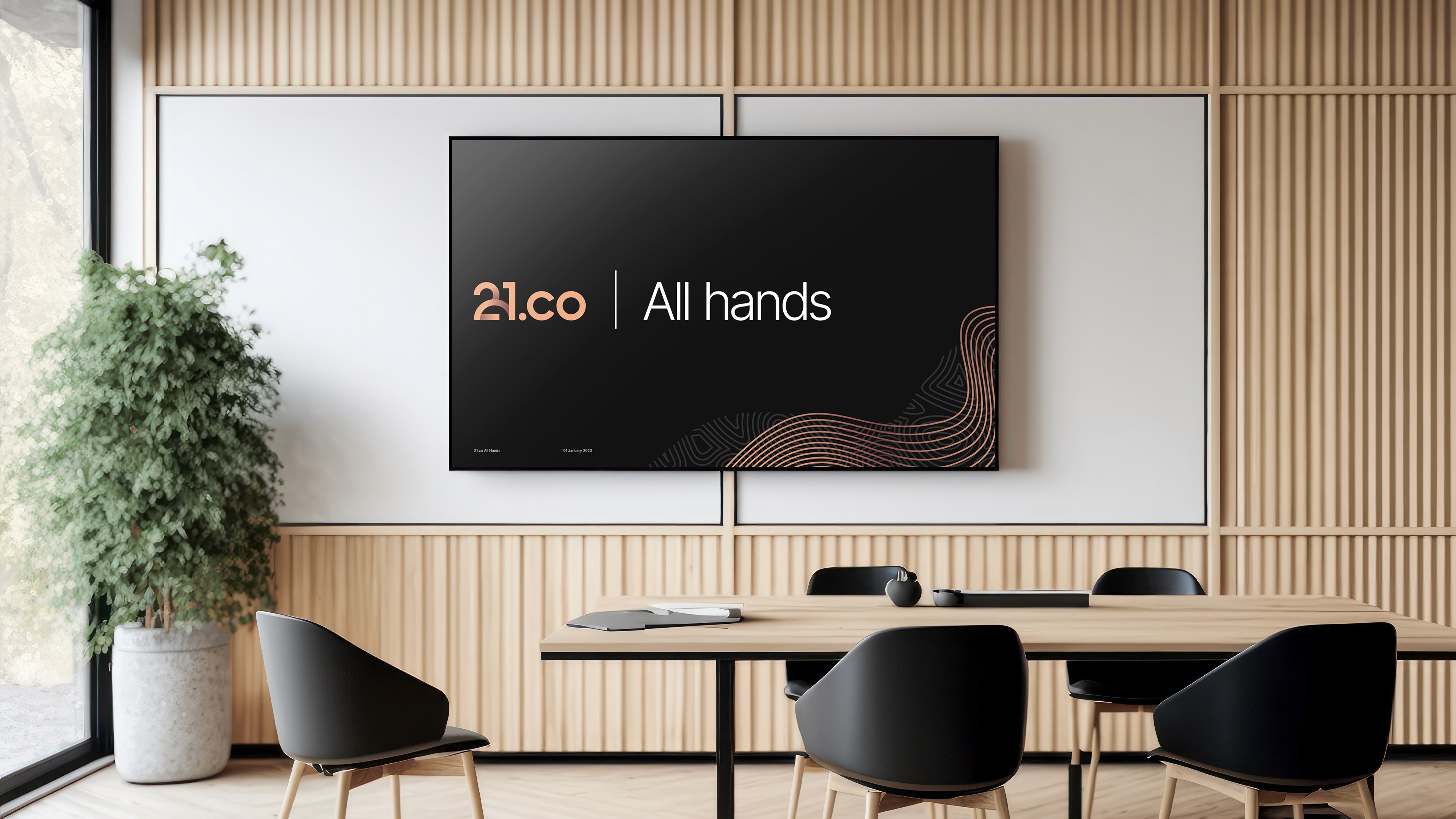

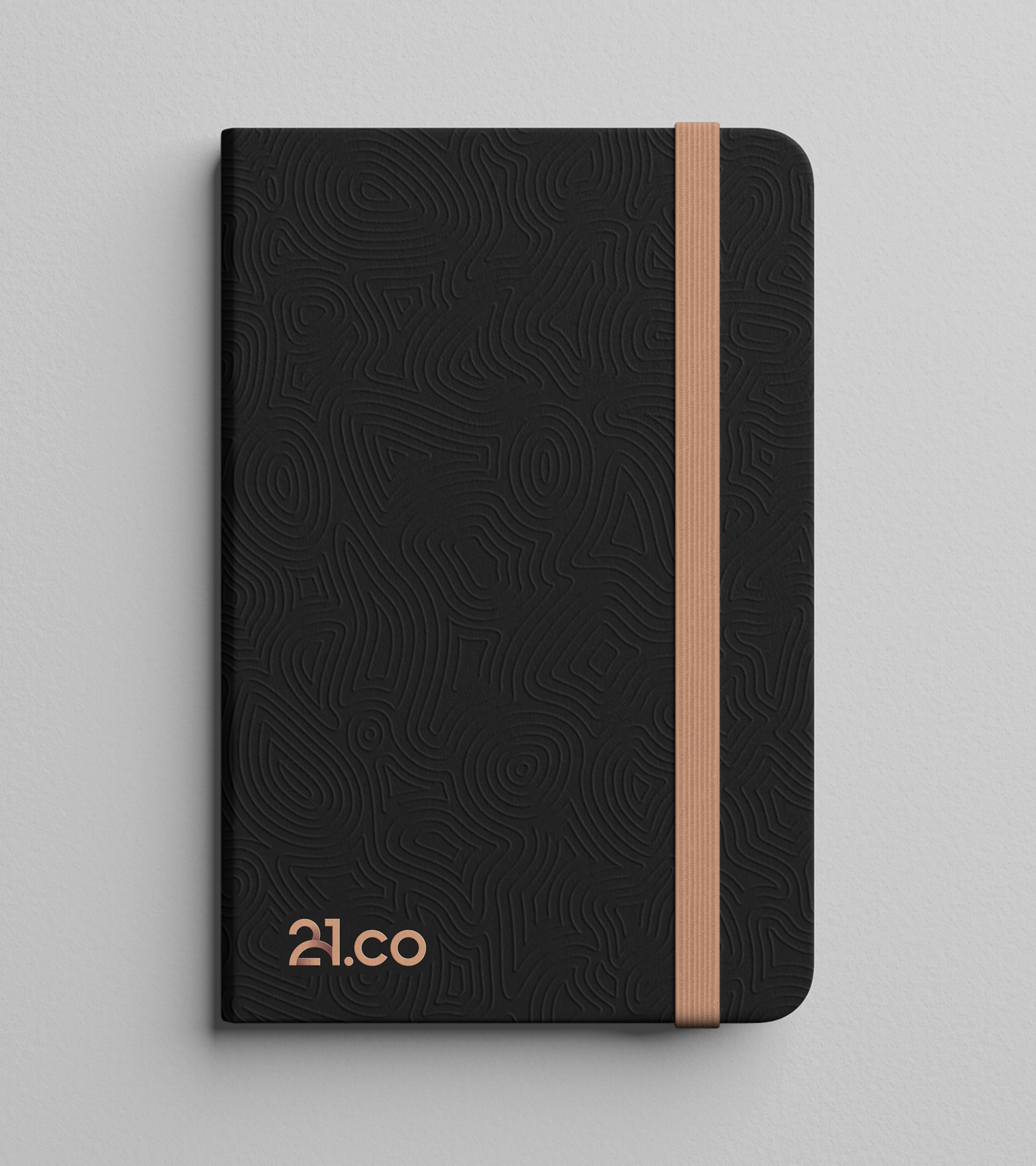
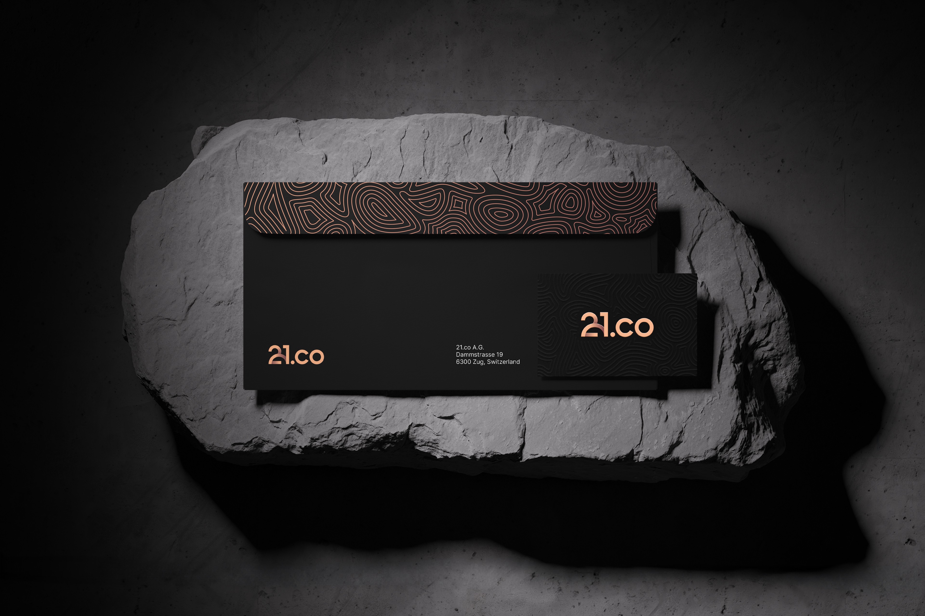
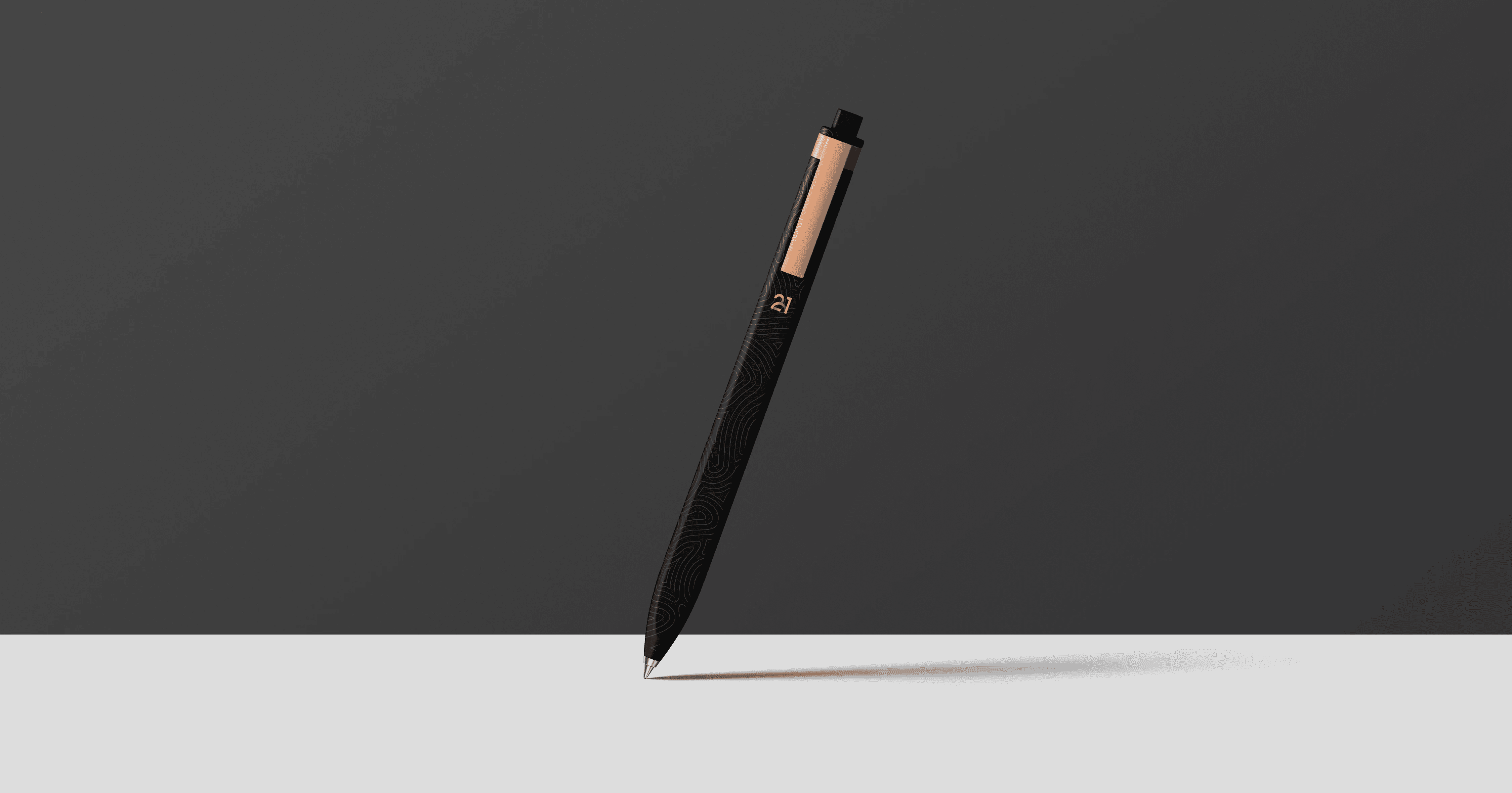
Brand patterns
Brand patterns
21.co uses three structurally different patterns that are inspired by it's mission and values. Together with the established color set and brand font they create a simple yet original and memorable look.
21.co uses three structurally different patterns that are inspired by it's mission and values. Together with the established color set and brand font they create a simple yet original and memorable look.
Art direction
Art direction
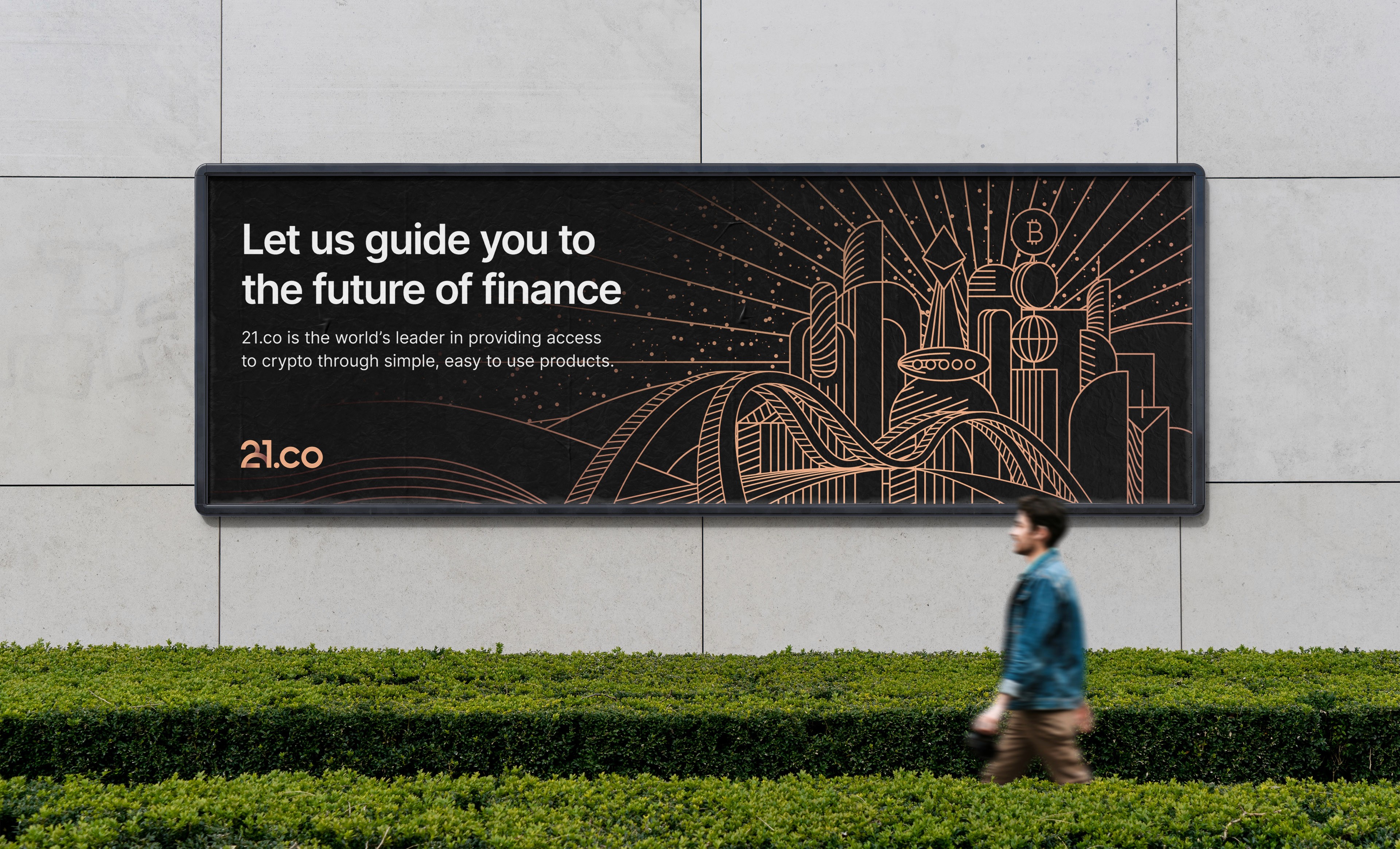
The illustrations are designed to look like blueprints, which is fitting for a company that on one hand is supposed to be a platform for all of it's sub-brands, but on another serves as a guide in the crypto sphere for external parties. The key visual is a futuristic crypto city with a bridge leading to it, which is yet another way to highlight the company's mission.
The illustrations are designed to look like blueprints, which is fitting for a company that on one hand is supposed to be a platform for all of it's sub-brands, but on another serves as a guide in the crypto sphere for external parties. The key visual is a futuristic crypto city with a bridge leading to it, which is yet another way to highlight the company's mission.

Credits
Credits
Creative supervision: Marina Krutchinsky
Creative direction: Marina Krutchinsky & Myself
Brand design & brand guidelines: Myself
Illustrations and iconography: Myself
UI Design: Filip Geschwandtner & Myself
Animations: Myself